
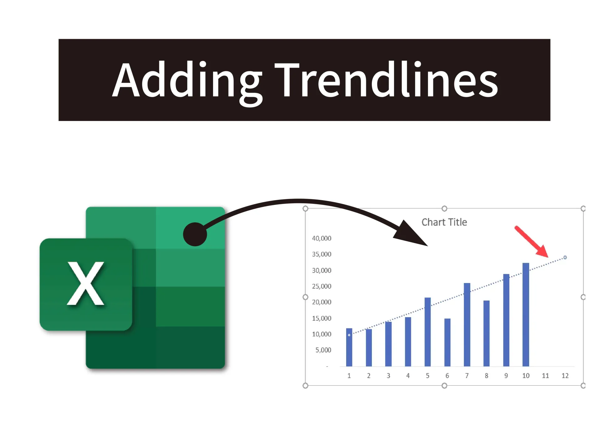
Trendlines are a great way to visualize data’s general pattern and direction in Excel charts. Adding a trendline can help you forecast future points based on historical data. In this post, I’ll walk through the steps to add different types of trendlines and customize their display.
1. Choose the Right Chart Type
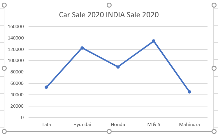
Trendlines work best on time-series line charts where the x-axis contains time units like years, months, days, etc. So first create a line chart with your data over time.
2. Select the Data Series
Click directly on the line or data series that needs the trendline. This will highlight the line in a darker color, and the trendline will be added to this selected series.
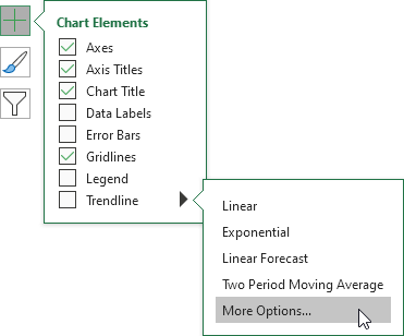
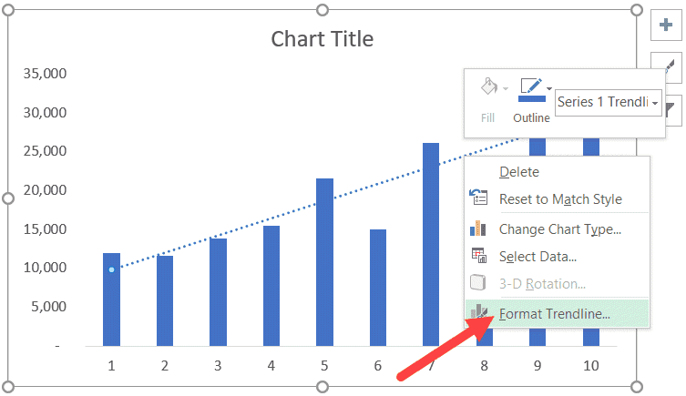
3. Open Format Trendline Pane
Vaya a la pestaña “Formato” en la barra de herramientas del gráfico. En el grupo “Selección actual”, haga clic en la flecha desplegable de Línea de tendencia. Esto abrirá el panel Formato de línea de tendencia.
4. Select the Trendline Type
En el panel, marque la casilla correspondiente al tipo de línea de tendencia que desee:
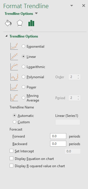
– Linear – For a straight-line fit
– Exponential – For exponential growth/decay
– Moving Average – Smooths out fluctuations
– Polynomial – Flexible curves
– Logarithmic – For logarithmic data
Las opciones cambiarán según el tipo seleccionado.
5. Customize Trendline Display
Puede modificar el aspecto y la visualización de la línea de tendencia:
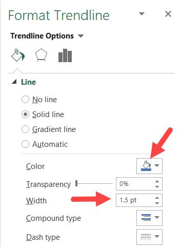
– Color de línea, grosor, tipo de trazo
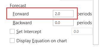
– Forecast amount – Extend trendline into the future
– Muestra el valor R cuadrado y la ecuación
– Establecer valor de intersección
6. Trendline Labeling
Marque las casillas “Mostrar ecuación en el gráfico” y “Mostrar valor R cuadrado en el gráfico”. Esto etiqueta claramente la línea de tendencia.
7. Forecasting with Trendlines
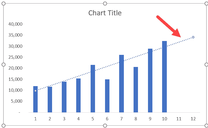
Right-click on the trendline and select “Format Trendline”. Under Forecast, enter the x-value to predict the future y-value.
And that’s it! With these steps, you can add and customize trendlines to visually analyze patterns in your Sobresalir charts. Let me know if you have any other questions!


 No products in the cart.