
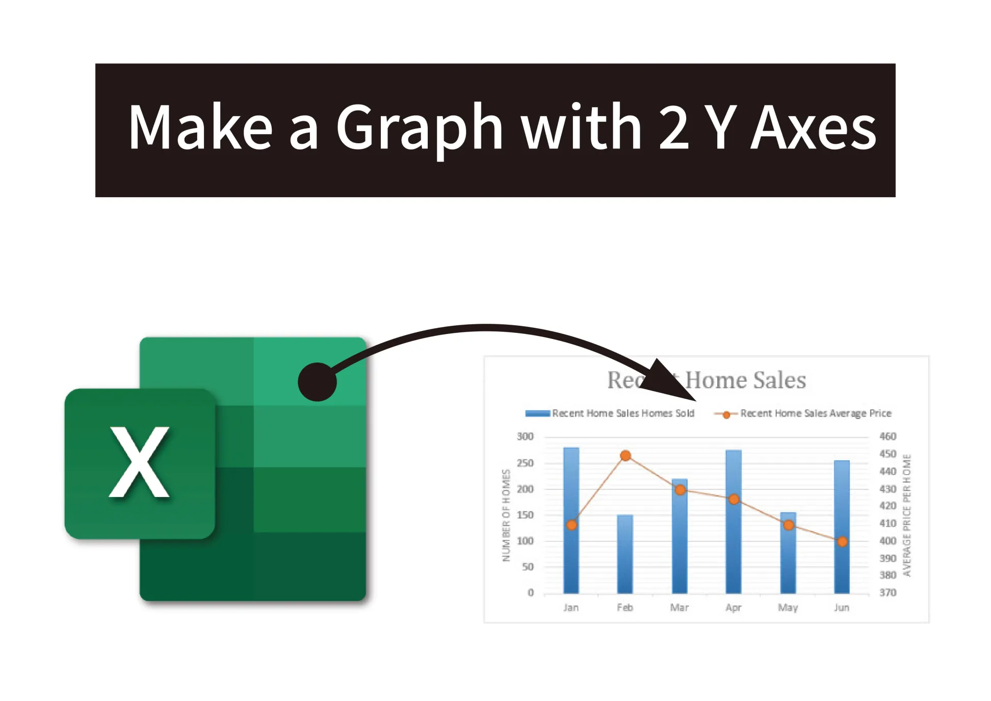
When plotting multiple data series in one chart, sometimes the units or scale differ widely between the data sets. Plotting this on a single y-axis makes the chart hard to read.
The solution is to create a dual-axis chart in Excel with 2 y-axes, one for each data series. Here is a step-by-step guide:
1. Set up the data
Organize your data into columns, with each data series in its own column. The x-axis values should be in the first column.
For example:
“`
Month Revenue Expenses
Jan $50,000 $8000
Feb $60,000 $7500
Mar $80,000 $9000
“`
This enables plotting Revenue on the primary y-axis and Expenses on the secondary y-axis.
2. Create a combo chart
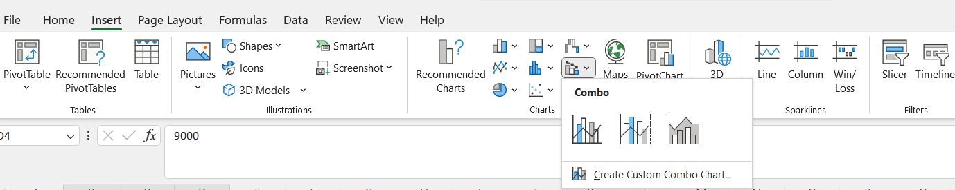
Go to Insert > Combo Chart and pick the clustered column and line combo. This creates a column and line hybrid chart by default.
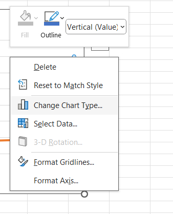
3. Move the second data series
Click on the secondary data series (line chart) and under Chart Tools, click “Move Chart”. Move the data series to the secondary axis.
4. Edit axis titles
Double click on the primary y-axis title and enter “Revenue (million)”. Do the same for the secondary y-axis, entering “Expenses”.
5. Customize chart styles
Go to Chart Styles and pick a style that makes both axes clearly visible. Adjust colors and data labels as needed.
6. Scale the axes
Right click each y-axis separately and select Format Axis. Adjust the bounds and units to scale each axis appropriately.
And that’s it! The dual-axis chart clearly plots the different scales while preserving trend shapes. This is an effective technique to visualize 2 unrelated data series in Excel.


 No products in the cart.