
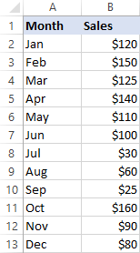
Step 1: Organize Your Data
Before you start creating your line graph, ensure that your data is well-structured. Follow these guidelines:
– Place your X-axis data in one column, typically on the left.
– Place your Y-axis data in an adjacent column.
– Include clear headers for each column to label your data.
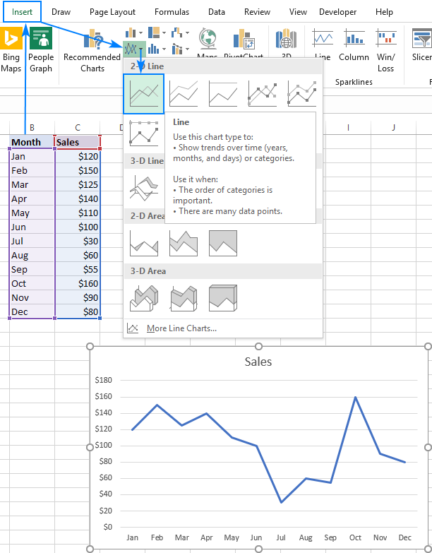
Step 2: Select Your Data
Highlight the data you want to include in your line graph, including the headers. This data will be used to create your chart.
Step 3: Insert a Line Chart
- Go to the “Insert” tab on the Excel ribbon.
- In the “Charts” group, click on the “Insert Line or Area Chart” icon.
Step 4: Customize Your Line Chart
- Once you’ve inserted the line chart, you can customize it in various ways:
– Chart Title: To add or edit a chart title, click on the chart title area, and then you can type in your desired title.
– Axis Labels: To customize the X-axis and Y-axis labels, click on the respective labels and edit them as needed.
– Data Labels: You can add data labels to your data points. To do this, select the data series, right-click, and choose “Add Data Labels.”
– Legend: If you have multiple data series, Excel will often generate a legend. To customize or remove the legend, click on it, and then you can adjust its properties.
- To format the chart elements (such as the chart area, plot area, or data series), right-click on them and choose “Format” to modify colors, line styles, fonts, and other visual properties.
Step 5: Adding Data Series
- If you have additional data series to add to your line graph (e.g., multiple lines representing different years or categories), right-click on the chart, select “Select Data,” and then click “Add” under the Legend Entries (Series). You can then select the new data range for the additional series.
Step 6: Save or Share Your Line Chart
- Save your Excel file to preserve your chart. To share it, you can copy and paste the chart into presentations, reports, or other documents.
- To export the chart as an image or PDF, select the chart, right-click, and choose “Copy” or “Save as Picture.” You can also use the “Save As” option to save the entire worksheet as a PDF.
Step 7: Updating Your Line Chart
- If your data changes or you want to update your chart, right-click on the chart, and select “Edit Data.” You can then modify your data directly in the Excel worksheet, and the chart will automatically update to reflect the changes.
By following these detailed steps, you can create, customize, and work with line graphs effectively in Excel. Line graphs are valuable for visualizing trends, changes, and comparisons within your data.


 No products in the cart.