
Introduction
Linear regression is a statistical technique used to understand and quantify the relationship between two variables. Excel provides a user-friendly way to create linear regression graphs. In this tutorial, we’ll cover:
- How to Perform Linear Regression in Excel
- How to Create a Scatter Plot with a Regression Line
- Interpreting the Linear Regression Graph
How to Perform Linear Regression in Excel
- Organize Your Data: Ensure you have two sets of data in Excel, one for the independent variable (X) and one for the dependent variable (Y).
- Calculate Regression Parameters:
– In a blank cell, use the `SLOPE` and `INTERCEPT` functions to calculate the slope (m) and intercept (b) of the regression line. For example:
– `=SLOPE(Y-Range, X-Range)` for the slope.
– `=INTERCEPT(Y-Range, X-Range)` for the intercept.
- Create a Scatter Plot: Highlight both the X and Y data columns, go to the “Insert” tab, and select “Scatter Plot.” Choose a scatter plot with markers only (without lines) for now.
How to Create a Scatter Plot with a Regression Line
- Add the Regression Line:
– Right-click on one of the data points on the scatter plot.
– Choose “Add Trendline.”
– In the “Format Trendline” pane, select “Linear” as the trendline type.
- Display the Equation and R-squared Value:
– Check the “Display Equation on Chart” and “Display R-squared Value on Chart” options to add these details to your graph.
- Format the Chart:
– Customize your chart by adding titles, labels, and formatting options to make it visually appealing and informative.
Interpreting the Linear Regression Graph
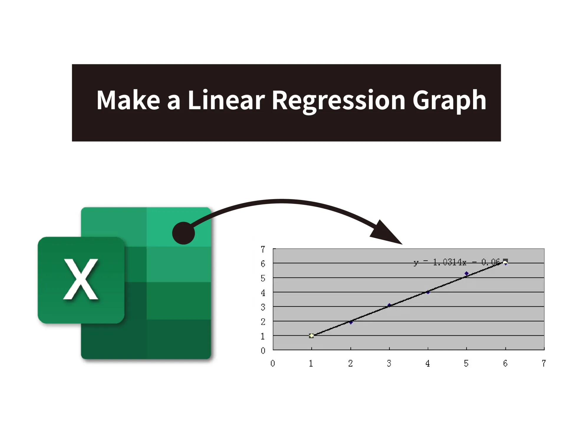
- Regression Equation: The equation displayed on the graph represents the linear regression equation in the form of Y = mx + b, where “m” is the slope and “b” is the intercept. This equation allows you to make predictions based on the relationship between the variables.
- R-squared Value (R²): R-squared measures the goodness of fit of the regression line to the data. A higher R-squared value (closer to 1) indicates a better fit.
- Scatter Plot: The scatter plot displays the individual data points. These points should be roughly aligned with the regression line, demonstrating the strength and direction of the relationship between the variables.
- Residuals: Residuals are the vertical distances between each data point and the regression line. Examining residuals can help you assess how well the linear regression model fits your data.
Conclusion
Creating a linear regression graph in Excel is a valuable tool for understanding and visualizing the relationship between two variables. With Excel’s built-in functions and charting capabilities, you can perform regression analysis quickly and effectively. Remember to interpret the results carefully to draw meaningful conclusions from your data.


 No products in the cart.