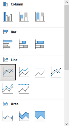
Combo charts in Excel allow you to combine two chart types like a column and line chart into one. This helps visualize two different data series together while preserving the unique shape and trend of each series.
Here are the steps to create a combo chart in Excel:
1. Set up the data
Organize your data into columns with each data series in its own column. One set of values will be plotted as columns and the other as a line.
For example:
“`
Year Revenue Expenses
2016 $200,000 $80,000
2017 $250,000 $90,000
2018 $300,000 $120,000
“`
2. Insert a combo chart
Go to the Insert tab, and under charts select the Combo Chart icon. Pick the clustered column and line combo.

3. Choose the chart types
In the pop up, you can choose which data series goes on each axis:
– Primary axis (columns): Revenue
– Secondary axis (line): Expenses
Click OK to insert the combo chart.
4. Customize the chart
Now you can format and customize the chart:
– Edit the axis titles and labels
– Change column and line colors
– Add data labels
– Adjust column width
– Add a legend

5. Modify the scale
Since the units differ, right click each axis > Format Axis to adjust the bounds and units to properly scale both vertical axes.
And that’s it! With combo charts, you can leverage the strengths of different chart types to create clearer comparisons and unique insights.


 No products in the cart.