Windows 12 Is Almost Here: What’s New, When to Download, and How to Get Read
Windows 12 has been the talk of the tech world for months now, and after Windows 11, it’s clear that Microsoft isn’t slowing down. So, what can we expect from…
Windows 12 has been the talk of the tech world for months now, and after Windows 11, it’s clear that Microsoft isn’t slowing down. So, what can we expect from…
Line graphs are a popular Excel chart type to visualize trends and changes over time. While the steps are mostly similar across Windows and Mac, there are some differences to…
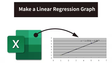
Introduction Linear regression is a statistical technique used to understand and quantify the relationship between two variables. Excel provides a user-friendly way to create linear regression graphs. In this…
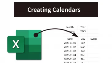
Creating calendars in Excel is not only a breeze for Excel wizards but also a versatile tool for a multitude of unexpected and convenient purposes. In this tutorial blog, we’ll…
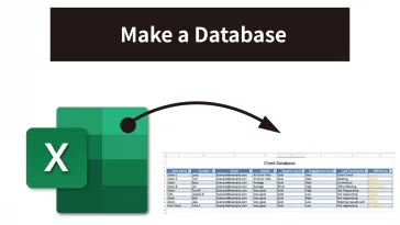
Creating a database in Excel may not make you a database guru, but it’s a practical way to manage and organize your data effectively. In this tutorial blog, I’ll take…
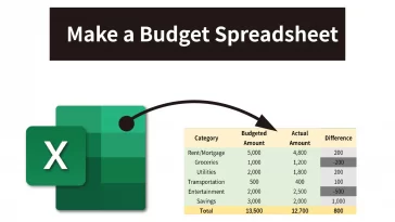
Are you new to Excel and feeling a bit overwhelmed by its seemingly endless features? Fear not! In this beginner-friendly tutorial, we’ll explore some handy Excel tips and tricks that…
Step 1: Open Excel Begin by opening Microsoft Excel on your computer. If you don’t have Excel, you can use Google Sheets, which offers similar functionality and is available…
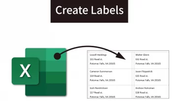
Introduction Creating labels in Microsoft Word from an Excel list is a time-saving and efficient way to print labels for mailing, labeling products, or organizing items. In this step-by-step…
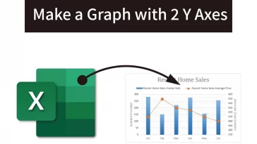
When plotting multiple data series in one chart, sometimes the units or scale differ widely between the data sets. Plotting this on a single y-axis makes the chart hard to…
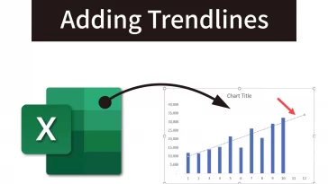
Trendlines are a great way to visualize data’s general pattern and direction in Excel charts. Adding a trendline can help you forecast future points based on historical data. In this…